Sustainability Practice at ASU

Sustainability Practice at ASU

Redesign Waste Directory

Redesign Waste Directory

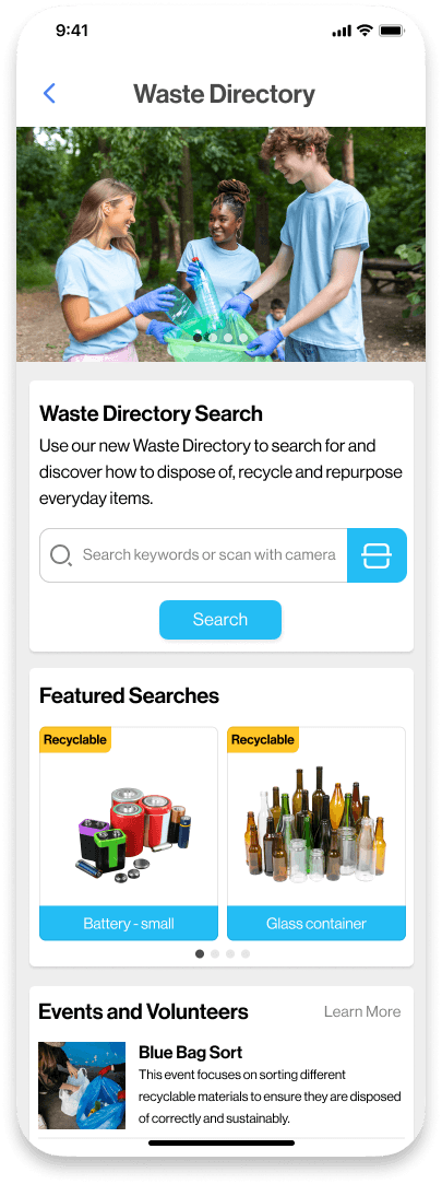
Waste Directory is designed for ASU students and staff, simplifying waste sorting with quick search, barcode scanning, and a map to locate recycling bins. It’s recycling made simple and accessible for the campus community.

Waste Directory is designed for ASU students and staff, simplifying waste sorting with quick search, barcode scanning, and a map to locate recycling bins. It’s recycling made simple and accessible for the campus community.

Team

Team

Team

2 Engineers,

1 Project Manager

2 Engineers,

1 Project Manager

2 Engineers,

1 Project Manager

Role

Role

Role

UX Design

UX Research

UX Design

UX Research

UX Design

UX Research

Tools

Tools

Tools

Figma

Qualitative Research

Figma

Qualitative Research

Figma

Qualitative Research

Timeline

Timeline

Timeline

2 months

2 months

2 months

Introduction and Current Challenges

Introduction and Current Challenges

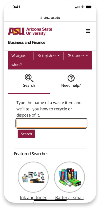
At Arizona State University (ASU), many students and staff struggle with waste sorting and recycling. Although the ASU Zero Waste Department offers a waste directory tool on its website, it isn’t user-friendly on mobile devices, leading to low engagement. To address this, I proposed redesigning the tool as a mobile app integrated into the My ASU App, allowing users to access information anytime, anywhere.

At Arizona State University (ASU), many students and staff struggle with waste sorting and recycling. Although the ASU Zero Waste Department offers a waste directory tool on its website, it isn’t user-friendly on mobile devices, leading to low engagement. To address this, I proposed redesigning the tool as a mobile app integrated into the My ASU App, allowing users to access information anytime, anywhere.

Current Issues

Current Issues

  1. The mobile interface is not intuitive, making searches difficult and impacting the user experience.

  2. Users often forget how to access the site, leading to low usage.

  3. The directory isn’t connected to other ASU digital services, creating a disjointed experience.

  1. The mobile interface is not intuitive, making searches difficult and impacting the user experience.

  2. Users often forget how to access the site, leading to low usage.

  3. The directory isn’t connected to other ASU digital services, creating a disjointed experience.

Current Interface Problems

Current Interface Problems

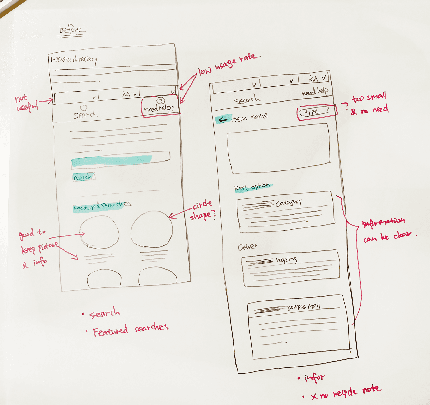
  1. The search bar and results are not optimized for smaller screens, making navigation difficult.

  2. The navigation design is not intuitive, making it hard for users to find what they need.

  1. The search bar and results are not optimized for smaller screens, making navigation difficult.

  2. The navigation design is not intuitive, making it hard for users to find what they need.

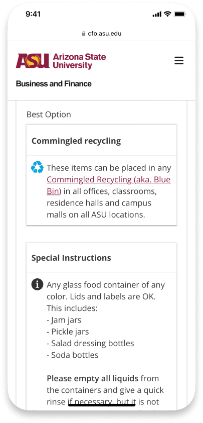
The 3 current pages

The 3 current pages


The Goal/ Objective

The Goal/ Objective

To improve the usability and accessibility of the Waste Directory, particularly on mobile devices.

To integrate the directory seamlessly into the My ASU App for a unified user experience.

To improve the usability and accessibility of the Waste Directory, particularly on mobile devices.

To integrate the directory seamlessly into the My ASU App for a unified user experience.

“How might we create an accessible, user-friendly Waste Directory that integrates with ASU's digital tools and encourages active participation in waste sorting?”

“How might we create an accessible, user-friendly Waste Directory that integrates with ASU's digital tools and encourages active participation in waste sorting?”

Research

Research

To understand why the current waste directory was underused and what users truly needed in a new tool, I conducted surveys and focus group interviews with students and staff.

To understand why the current waste directory was underused and what users truly needed in a new tool, I conducted surveys and focus group interviews with students and staff.

Key Findings

Key Findings

Here are interview key findings included:

Low Awareness (78% Unaware)

Participants felt the tool lacked engaging features and wished for additional activities related to sustainability

"If there were follow-up events or activities, I’d be more interested in using the tool."

Low Awareness (78% Unaware)

Most participants did not know the waste directory existed, as it was buried on the ASU website. Also you have remember the website IP.

"I didn’t even know there was a tool for this until someone told me."
"I had no idea there was even a tool for waste sorting at ASU."
Uncertainty in Search Terms (62% Struggled)

Users struggled with the search process because they often didn’t know the specific names of items to look up.

"Sometimes, I’m not sure what to type in, so I can’t find the information I need."
Complex Information and Lack of Guidance

The information provided was too complicated, and there was no map to guide users to nearby disposal locations.

"It would be so much easier if I could see where the nearest recycling bin is."

Low Awareness (78% Unaware)

Participants felt the tool lacked engaging features and wished for additional activities related to sustainability

"If there were follow-up events or activities, I’d be more interested in using the tool."

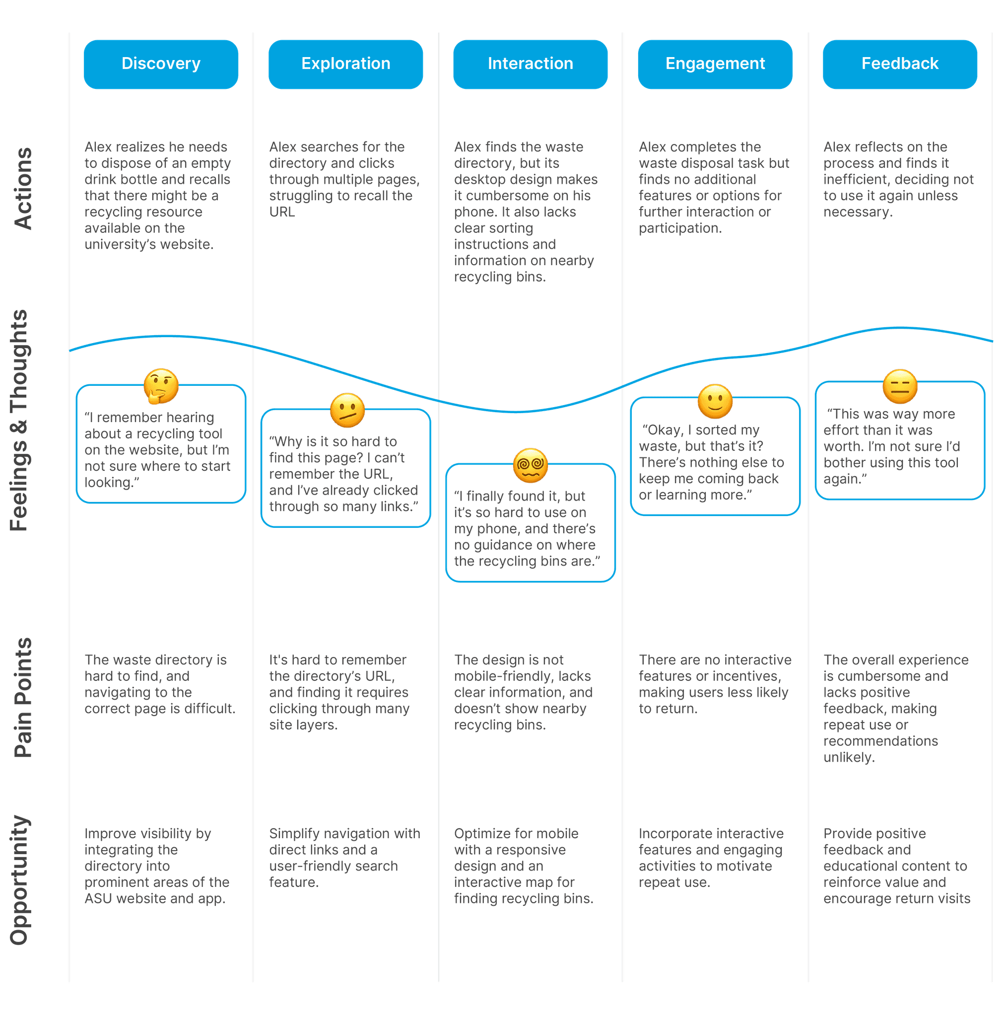
Mapping the Current Experience

Mapping the Current Experience

I created user journey maps to illustrate current user paths and identify challenges. These visuals helped identify key areas that needed improvement.

Solution Approach

Based on research insights, I developed the following design solution:

Low Awareness

Embed the Waste Directory as a mobile feature within the My ASU App

Embed the Waste Directory as a mobile feature within the My ASU App

Uncertainty in Search Terms

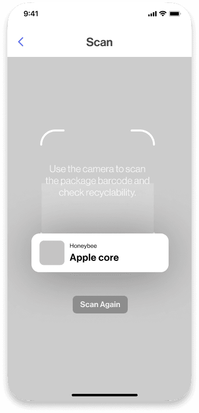
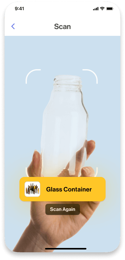
Enhanced Search Functionality: Users can search with keywords or scan a barcode for waste sorting instructions.

Enhanced Search Functionality: Users can search with keywords or scan a barcode for waste sorting instructions.

Complex Information and Lack of Guidance

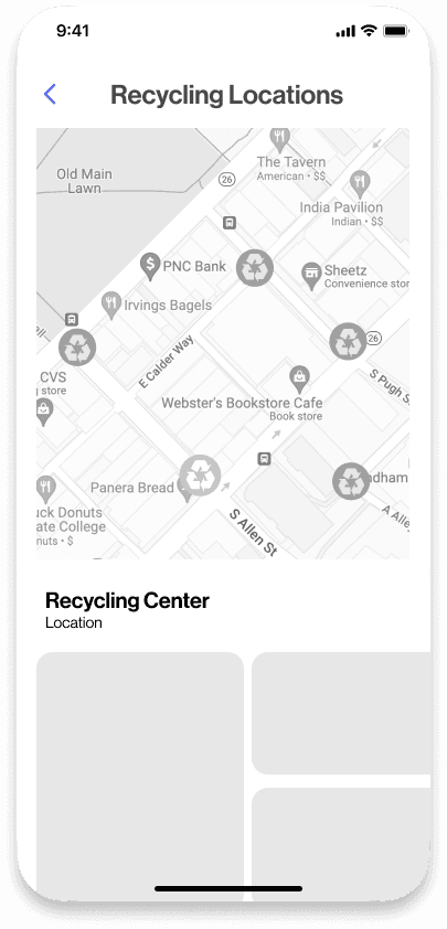
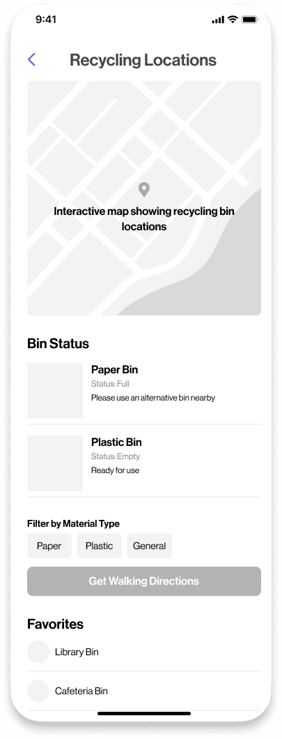
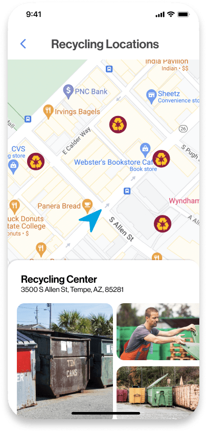
Disposal Location Mapping:

A map helps users locate nearby waste disposal sites with navigation support.

Disposal Location Mapping:

A map helps users locate nearby waste disposal sites with navigation support.

Lack of Engagement Opportunities

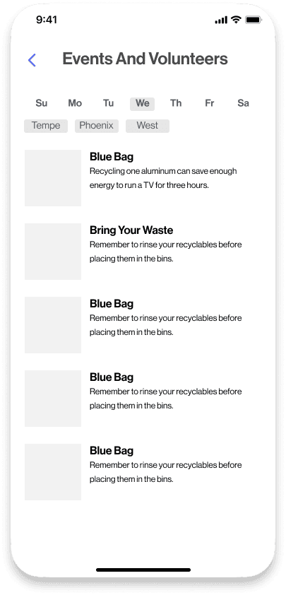
Community Volunteer:

Users can find and join ASU volunteer activities through a dedicated section, encouraging more participation.

Community Volunteer:

Users can find and join ASU volunteer activities through a dedicated section, encouraging more participation.

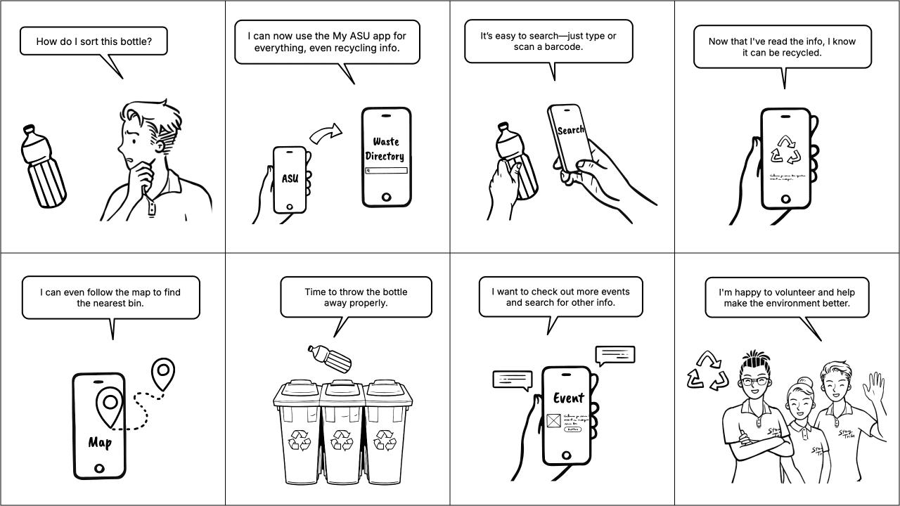
Storyboard the New Experience After Redesign

I made the storyboard based on these solution ideas to show the improved user journey after the waste directory redesign. It highlights key steps, easier processes, and new features that make waste sorting and recycling simpler and more engaging for ASU students and staff.

Design Process

To start my design process, I first examined ASU’s existing design language to align my work with the university’s brand standards. I analyzed ASU’s color scheme, typography, and interaction patterns to create a cohesive design framework. This approach ensured that my design would feel familiar and consistent with the current user experience

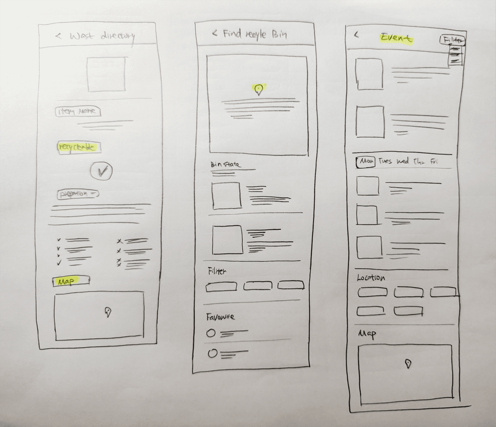
Sketches and Wireframes

Sketches and Wireframes

In the initial phase, I started by reviewing and analyzing existing interfaces and identifying potential pain points. This step helped me understand what improvements were needed.

Based on my findings, I explored different layout options and sketched out various design concepts. For example, when integrating a recycling search feature into the MyASU app, I created a prominent search bar for easy access to recycling locations. These sketches laid the groundwork for understanding element placement and user flow.

I then developed medium-fidelity wireframes, adding details like navigation menus and information cards to provide a more complete view of the interface.

Preliminary Usability Testing

Preliminary Usability Testing

I tested the mid-fidelity wireframes with 10 users to get feedback on the main functions and layout.

High-Fidelity Prototype

For the high-fidelity prototype, I used ASU’s official colors—maroon, gold, and blue—and branded fonts to match the university’s style. I also improved the layout and made the interactive elements clearer for a better user experience.

High-Fidelity Prototype

High-Fidelity Prototype

For the high-fidelity prototype, I used ASU’s official colors—maroon, gold, and blue—and branded fonts to match the university’s style. I also improved the layout and made the interactive elements clearer for a better user experience.

User Testing and Iteration

After completing the high-fidelity prototype, I conducted comprehensive usability testing to observe how users navigated and interacted with the design. This testing phase was essential to validate the effectiveness of design choices and identify any remaining usability issues.

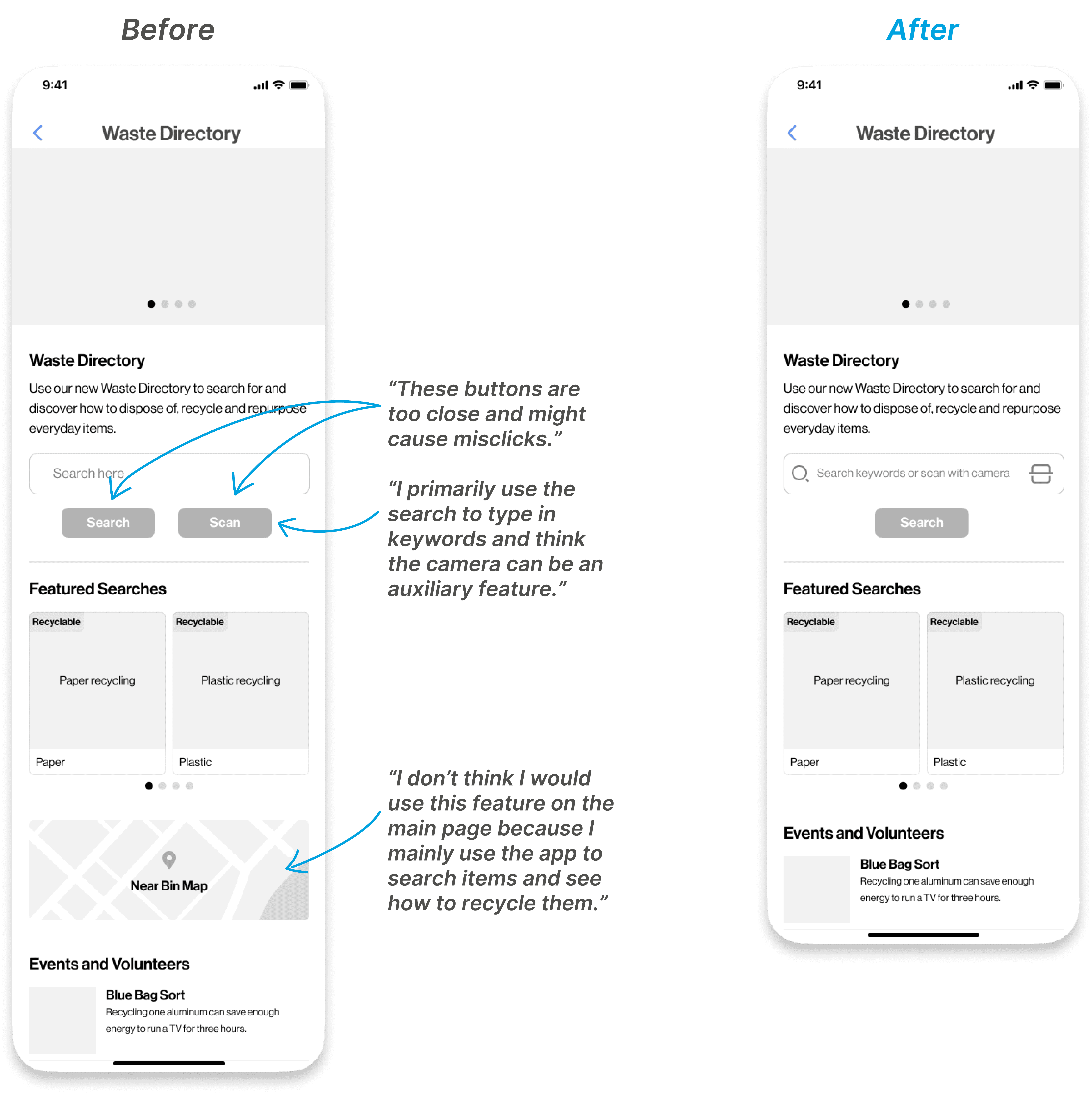
Based on feedback from the usability tests, I made targeted refinements to the high-fidelity prototype. Users suggested increasing the spacing between key elements and improving the visual hierarchy for better clarity.

Technical Feasibility

To ensure technical feasibility, project manager and I collaborated closely with the development team throughout the project. Together, we assessed the technical framework, including API integrations and backend processes, to align the design with implementation constraints.


One of the key challenges was optimizing search functionality for faster results on mobile devices. Through discussions, the development team identified performance bottlenecks in the backend system. Based on their recommendations, I adjusted the design to include progressive loading indicators and simplified search result displays, balancing performance and usability.

Final Design

Outcome and Impact

The redesign of the Waste Directory improved usability and accessibility on mobile devices and integrated it into the My ASU App. The project led to the following outcomes:

One of the key challenges was optimizing search functionality for faster results on mobile devices.


Driving Active Engagement and Environmental Awareness

The app saw a rise in daily active users. Many students used it to learn proper waste disposal and recycling practices, helping them make more informed decisions.

Improving Campus Recycling Efficiency

Clear instructions on waste disposal helped students follow recycling guidelines. This resulted in more accurate sorting and increased recycling rates on campus.

Increasing Participation in Sustainability Programs

The app made it easier for students to register for sustainability-related volunteer programs. This led to more sign-ups and greater participation in campus environmental initiatives.
Reflection and Learnings

Leading the Waste Directory app redesign from research to design was a key learning experience for me. It was my first time managing the entire process alone, and it taught me how to balance user needs, technical constraints, and project goals.


Working with the development team showed me the importance of aligning on technical feasibility early to avoid challenges later. Conducting user research and applying it directly to the design emphasized the need to stay focused on users throughout the process.


This project also taught me the importance of owning a project from start to finish and how feedback can improve outcomes through iteration.

Designed by Winnie • 2024

Designed by Winnie • 2024

Designed by Winnie • 2024