Hongshan Forest Zoo App
Turning a zoo visit into a gamified science adventure through 3D wayfinding, AR collection, and bite-sized educational games.
Role: Product Designer
Timeline: 2024
Research: 253 survey responses, user interviews, usability testing

01. The Challenge
Nanjing Hongshan Forest Zoo is one of China's top-rated zoos. 5 million annual visitors, 60 hectares of natural habitat, and a nationally designated science education base focused on wildlife conservation.
The zoo had the content, the audience, and the mission. What it lacked was a digital experience that tied all three together.
61.88%
of visitors plan itineraries before arriving, then ditch them once inside.
26%
have ever opened the zoo's existing app.
"Chaos"
become visitors used most to describe their visit.
The zoo had invested in beautifully illustrated signage covering animal ecology and behavior. Visitors walked right past it. The education strategy wasn't failing because the content was weak. It was failing because static signage can't compete with a live animal twenty feet away.
02. Research & Key Insights
Two user types, one shared space, competing needs. This raised the central design question:
How might we serve both the explorer who wanders and the optimizer who hunts?
To answer that, I mapped both personas across the full visit lifecycle to identify exactly where the experience breaks down and where design can intervene:
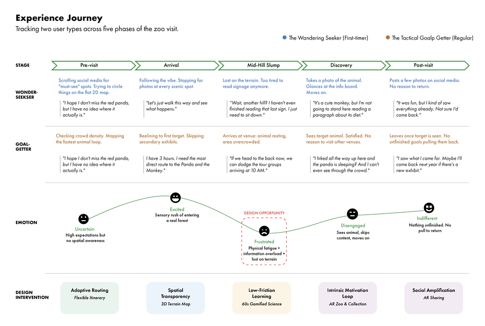
As a science education base, the zoo aims to teach conservation. However, interviews revealed a gap: visitors want to explore, not be lectured. While they cared for the animals, most couldn't recall a single fact from traditional signage.
"If learning feels like discovery, not a lecture, visitors opt in voluntarily."
This shifted the design direction: embed education within exploration so learning becomes a natural byproduct of motivated behavior.
Drawing from 253 survey responses and 12 in-depth interviews, two distinct visitor patterns emerged:
-
The Wandering Seeker (First-timer): Seeks wonder while managing physical exhaustion.
-
The Tactical Goal-Getter (Regular): Seeks efficiency without losing the joy of the visit.


03. Competitive Landscape
With a clear picture of user needs, I audited existing products in the space.

Disney Resort App
+ strength: Industry-leading gamification using personality quizzes and character dress-ups to drive engagement.
- gap: Completely decoupled from the physical park visit; doesn't influence or change real-world behavior.

Universal Beijing App
+ strength: Highly mature utility features, specifically for efficient wayfinding and real-time queue management.
- gap: Purely transactional experience that lacks emotional connection to the animals or educational mission.

WTF Together App
+ strength: Exceptional interactive storytelling using gesture-driven content to create deep animal immersion.
- gap: A standalone digital product with no integration or functionality for a physical venue.
Each product nailed one dimension. None combined gamification, wayfinding, and education within the context of an actual visit. That gap defined my design opportunity.
04. From Insight to Interface

02
Flow Chart
Mapped the end-to-end user decision tree, which became the foundation for the final information architecture.
01
Storyboard
Plotted the full visit narrative to pinpoint where gamification touchpoints should sit, not as a standalone feature, but integrated across each phase of the journey.

Before moving to high-fidelity, I used three low-fi methods to map the experience architecture.

03
Design Sketches
Rapid explorations of the home screen, map, and game entry points to test layout hypotheses early.
05. Design Solutions
A
3D Map with Crowd Visualization
Spatial Transparency
The Problem: The zoo's hilly terrain is invisible on 2D maps. A "short" route on screen often translates to an exhausting 15-minute uphill climb in reality.
The Solution: A 3D terrain map that provides spatial transparency, showing true elevation and real-time crowd density to help visitors choose paths that match their energy levels.

I explored fully automated routing driven by real-time crowd data, but deliberately moved away from it. A zoo visit isn't a commute. The act of choosing "I want to see the panda" is part of the experience itself. The design should support user agency, not override it.
B
Flexible Itinerary
Spatial Transparency
The Problem: Visitors dislike rigid schedules but often feel lost without a plan. They value spontaneity but fear missing key animal sightings.
The Solution: The app suggests an optimized path but allows for one-tap detours. The itinerary dynamically reroutes around your choices in real-time.

I explored fully automated routing driven by real-time crowd data, but deliberately moved away from it. A zoo visit isn't a commute. The act of choosing "I want to see the panda" is part of the experience itself. The design should support user agency, not override it.
C
Gamified Science Games
Spatial Transparency
The Problem: Static signage fails to hold attention in a high stimulation environment. Visitors are fatigued and "opt-out" of traditional learning.
The Solution: By scanning QR codes at exhibits, visitors engage in 60-second animal quizzes to earn collectible digital badges, turning education into a game.

First iteration was 2 to 3 minutes. Users dropped off halfway, not because it was hard, but because they were standing in the sun. Physical context sets the ceiling for interaction length, not content. Cut to 60 seconds, completion jumped.
D
Gamified Science Games
Intrinsic Motivation Loop + Social Amplification
The Problem: Visitors cluster on main paths, often missing smaller venues with compelling species.
The Solution: A persistent "My Zoo" collection gallery encourages visitors to explore "blank spots" on the map to unlock virtual animal figurines and AR experiences.

"I chose collection over points intentionally. 'I have 350 points' carries no emotional weight. 'I've collected 23 animals and I'm missing 4' creates a tangible goal. The AR layer converts personal achievement into shareable content that drives organic reach for the zoo."
06. User Testing
I tested the prototype with 5 participants across both user types (3 Explorers, 2 Optimizers). Each session was a 30-minute moderated walkthrough of the core flows.
Key Insights:
"Collecting animal badges really motivates me."
Users voluntarily detoured to smaller venues to fill gaps in their collection. The intrinsic motivation loop worked as designed: collection gaps drove exploration more effectively than any suggested route.
"The scientific format is more engaging. I'm gaining knowledge instead of just walking around."
Users didn't describe the quizzes as "educational." They described them as "fun." That distinction matters. It confirmed the core insight: education works when it doesn't feel like education.
"The 3D map helps me understand the elevation."
Every participant could correctly predict which routes involved climbs before walking them. The 2D-to-3D pivot resolved the spatial comprehension gap.
User Concern
"Some people might get stuck midway through the collection."
Two participants said they'd feel overwhelmed seeing 40+ empty slots on day one.
Design Response
Redesign onboarding as a progressive unlock. Start with a starter set of 5 nearby animals, then expand the collection as users build momentum.
Next Step & Iteration
User Concern
"I'm not sure this would truly solve the queue problem."
Users trusted the 3D terrain but were skeptical of crowd indicators because they could tell the data wasn't live.
Design Response
Integrate the zoo's real-time visitor tracking system so density updates reflect actual conditions, not static estimates.
07. Reflection
My Final thought on this project, and areas for future growth:

Design FOR constraints, not around them
Users were fatigued, in direct sunlight, and distracted by live animals. Instead of fighting these conditions, I redesigned within them 60-second quizzes, progressive unlocks, spatial transparency. Strong solutions convert friction into design parameters.

Gamification is architecture, not decoration
Early versions layered badges onto existing flows, they felt gimmicky. The pivot: make collection the organizing principle of the entire experience. When gamification structures the journey rather than decorates it, adoption becomes organic.

Stated needs ≠ observed behavior
Survey data said "flexible plans." Field observation showed users paralyzed by too many options. The real need: agency within structure, not unlimited choice. Recognizing this gap is where UX projects succeed or fail.
Reach out →