top of page

aí
Turning the unfamiliar familiar. Understanding cancer through everyday touch.
01. Project Introduction
aí (癌, cancer in Chinese) translates cancer cell structures into everyday consumer products. I designed a complete retail experience including brand identity, typography, and product line that makes cancer awareness accessible through familiar objects.
02. Design Process


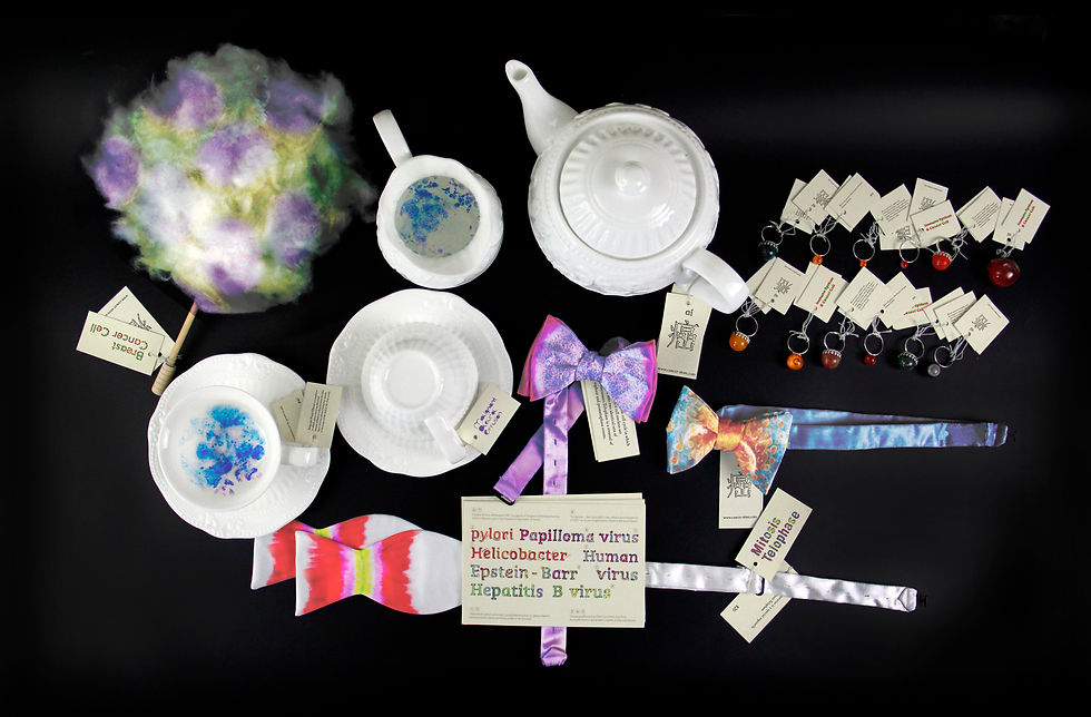
03
Product Line
Applied the visual system across everyday products: textiles, tableware, and accessories. Each item brings cancer awareness into daily life through familiar objects.


01
Research & Visual Development
Matched cancer cell shapes to everyday objects like bow ties, cups, and textiles. Applied medical staining colors to the naturally colorless cells, creating visual familiarity and emotional connection.
02
Brand Identity &
Typography
Created a custom typeface based on cellular forms—irregular, asymmetrical letterforms that mirror the organic shapes of cancer cells.

03. Final Design


bottom of page